GoldMax
Goldmax is an online platform that provides users with a convenient and hassle-free way to purchase movie tickets. With Goldmax, users can easily browse movie showtimes, select their preferred seats, and make payments securely from the comfort of their own homes.
My contribution
User experience design
User interface design
Paper & digital wireframe
Prototyping
usability testing
Problem Statement
It is noted that, many customers, especially students, are still purchasing tickets in physical stores, suggesting that there may be specific pain points or challenges that are preventing them from using the online platform.
Goal
Our goal is to identify and address these pain points in order to increase the number of customers using the online platform for ticket purchases.
Design Process
Empathize
Define
Ideate
Design
Test
Empathize
Find out the current experience and understand
what are their pain points when purchasing ticket
through research.
For my UX case study, I utilized a quantitative research
approach and created an online survey using Google Forms.
Insights from survey
Key pain points from user survey
Students are unable to apply their student
discount when purchasing movie tickets online.
The information on the site is overloaded,
causing users to be uncertain about which
discounts or promotions they are eligible for.
Other pain points
- The UI appears outdated, and the site could be more visually appealing and intuitive.
- Payment method not saved
- The experience of purchasing tickets in the physical stores vs online are different. Eg. physical ticket
- No E-ticket to check in. E ticket are emailed to us.
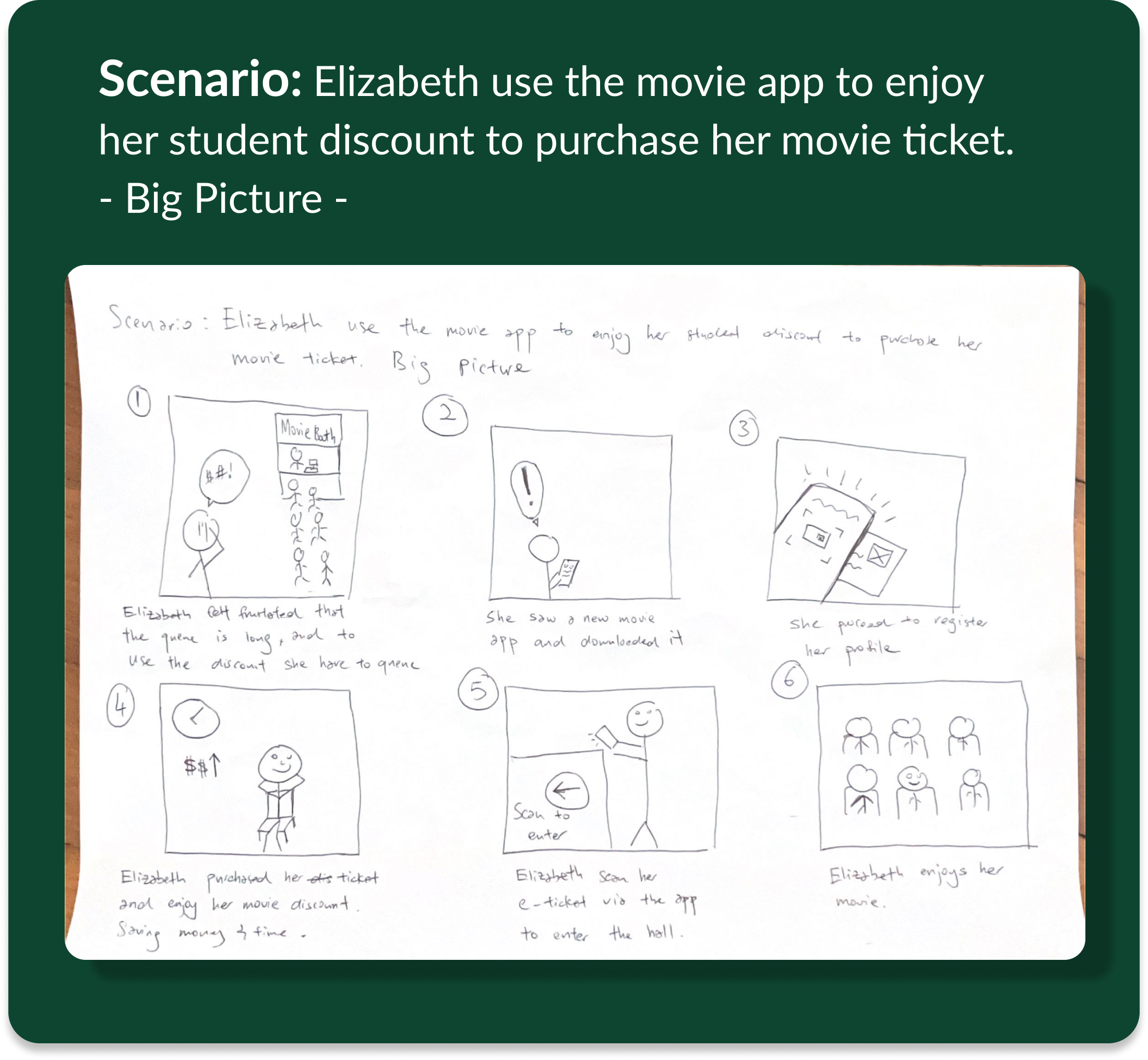
User Journey
Elizabeth
After creating my user persona, I began to visualize the steps
and feelings she might feel when purchasing her movie tickets.
User Flow
Using Miro to illustrate how user will navigate the app
Homepage 1st Draft
Movies Trailer on the top of the homepage
to give a quick sneak peek of the movie
Showing movies based on different category.
Eg. ‘ Now Showing , ‘Popular’and ‘coming soon’
After the wireframe prototype, users were invited to participate in a usability test.
The majority of users suggested that a search bar be added, as it would provide quicker access to movie searches.
Search bar added at the bottom of the screen.

Search bar added at the bottom of the screen.


Priority is to make the app
seamless & easy navigation
Movie & Seat Selection
E- Tickets
Creates visual and interactive component that interest users
Checkout Page
Draft 1
Using hierarchy and spacing to emphasize on key information
Quick access to other pages
During usability test, users mention that they prefer that the offer/discount page be at the same screen. There were too many clicks before users were able to select their discount.
Users can view eligible offers by clicking on the dropdown icon

Users can view eligible offers by clicking on the dropdown icon
Users can view eligible offers by clicking on the dropdown icon
GoldMax
A Seamless & Easy booking experiences

Verification of student ID
Student can now verify their ID in profile page
To enjoy student discount, students can
verify themselves under the profile page
by following the steps required.
Accessibility Consideration
Contrast
Using figma’s plugin to ensure that there is enough contrast
between text and its background so that it can be read by
people with moderately low vision
Text Clarity
Ensuring the use of clear fonts and styles to enhance
text clarity and readability.
E.g. Using paragraph spacing to make more it readability
Text Clarity
Ensuring the use of clear fonts and styles to enhance
text clarity and readability.
E.g. Using paragraph spacing to make it readability
Key Performance
Indicator
Using four indicators to help measure
the effectiveness of our design.
Time on Task
How much time user spent on completing a task.
Drop off Rate
How many users abandon the experience without completing the task.
User Error Rate
Keep track design where users make mistakes when completing the tasks assigned.
System Usability
Task
A questionnaire that asks participants their opinions about the experience.
User Centred
Design
Your design revolve around your user. Think about their pain points and accessibility. Inclusivity is key. No one like to be excluded.
Visual & Interaction
is Key
A design that incorporates effective visuals and interactions can provide users with a pleasant experience, and can also instil trust in the product.
This trust can make users more tolerant of any issues or limitations they may encounter, as they have confidence in the team behind the product.
No Design
is Perfect
No design is perfect ! That is why the design process is a cycle to ensure your product is constantly improving to meet the needs of users .
Challenges
Limited Research
During my Google UX certification case study, I encountered a challenge in getting sufficient responses from user surveys.
As I am doing this project alone, I lacked the resources to reach out to a large number of users and encourage participation in my survey.
Despite these limitations, I made the best use of the responses I received and drew valuable insights to inform my design decisions.
Personal Experience
When I began this case study, I drew from my personal experience as a student, but I also conducted interviews with my peers to gather insights on their experiences.
However, in hindsight, I recognize the importance of engaging current students to obtain more relevant and up-to-date data.
If I were to approach this case study again, I would prioritize reaching out to a diverse pool of current students to ensure that my research is grounded in their perspectives and needs.
What will I do next?
Conduct Usability Test
Using key indicator to test the effectiveness of the design.
Reiterate the design based on insights from the test.
Brainstorm
Comment section for movie rating and sharing thoughts
In-app movie watching.
Allowing users to watch movies directly from the app without having to visit the cinema
Chaik Hong © 2023
Design and built by myself with love & sweat
using Figma & Webflow